Product Hub September 25, 2015
Review: Pebble Time Has Charm
Pebble’s latest smartwatch is still charming, but comes with limitations.
Pebble’s latest smartwatch is still charming, but comes with limitations.
The granddaddy of smartwatches is back, boasting an updated, full-color version of the wearable that got put on the map three years ago with a $10.3 million Kickstarter launch. The newly released Pebble Time (which, like the original Pebble, was also launched on the popular crowdfunding site), has some great features – including extra-long battery life and an always-on e-paper display. But it also has some serious limitations, particularly the lack of a touchscreen interface that stands out sorely compared to the Apple Watch and Android Wear options.
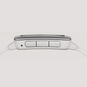
First, the aesthetics: The Pebble Time has a clunky, almost childish design, with a marine-grade stainless-steel bezel and a wide silicone strap available in red, black or white. The sturdy design is billed as water-resistant to 30 meters, and I can attest that showers and swims caused no ill effects.
As previously mentioned, the relatively small glass screen is not touch-sensitive; instead, users navigate using just four buttons: There’s a “back” button on the upper left corner of the watch face, and on the right side are up, “select” and down buttons. According to Pebble, these “tactile buttons” allow for easy, eyes-free control of the interface. But the operating system takes some getting used to and seems somewhat archaic for those of us accustomed to the simple swipe and tap action of a touchscreen. The Friday morning I strapped my Pebble Time on and started playing around, I somehow launched the music app on my smartphone, inadvertently regaling the office with random heavy metal riffs. Within a few days, however, I was blearily, yet expertly hitting “snooze,” when the surprisingly strong vibrating alarm woke me each morning.

The Pebble Time, which retails for $200, features a sturdy, waterproof design and a long battery life.
The display itself is clear and easy to read in direct sunlight, with no glare issues, but it can be a little dim indoors, though it’s a relatively simple matter to brighten the screen.
The Pebble Time benefits from a robust app store, with thousands available for download: health and fitness tracking apps; notification and organizational helpers; remotes to operate smart thermostats and music programs; and even some silly games. You can download a wide range of watch faces, from the merely pretty (like the Mondrian-inspired digital display I chose) to the functional (faces that display the weather and other information in addition to the current time).
Email, social media and other notifications are easily accessed and dismissed on the watch, and the timeline interface makes it simple to review upcoming appointments. A nice touch is the ability to answer text messages via preset phrases or by dictating a response through the built-in microphone.
The Pebble Time doesn’t come with a native fitness tracker, but lets you download trackers from Misfit, Jawbone, Morpheuz or other developers. The problem, though, is that the watch only allows you to use one app for tracking. I downloaded the Misfit app for step tracking and wanted to use Morpheuz as a “smart alarm” to wake me up gently over a preset period of time, but was not able to make both apps work. The watch also doesn’t offer a heart rate monitor; however, third-party developers can manufacture modular “smartstraps” that hook onto the Time’s magnetic charging port and augment its capabilities. So, added functionality like heart rate monitors or GPS sensors may become available.
One of the best features of the Time is the long battery life, especially compared to quick-draining competitors like the Apple Watch, which claims an “all-day” battery life of up to 18 hours. The Time holds a charge for up to seven days, according to the company website. My Pebble Time kept chugging along for about five days; I broke down and recharged it when it hit 10% battery life.
Verdict: With a $200 price tag, the Pebble Time is a relatively affordable smartwatch. Despite some notable disadvantages – like the lack of a touchscreen and heartrate monitor – the Time is a solid offering, with a battery life that can’t be beat, a sturdy, if slightly ugly, waterproof design and a wide array of apps. The potential to add functionality with smartstraps is intriguing and could push the Time ahead of competitors.
Theresa Hegel is a senior staff writer for Wearables. Contact her at thegel@asicentral.com and follow her on Twitter at @TheresaHegel.

Product Hub
Find the latest in quality products, must-know trends and fresh ideas for upcoming end-buyer campaigns.
