Product Hub October 23, 2014
Wearables Top Decorator
In the last challenge of the year, whose entry belongs in an art gallery? Plus, we name our Grand Prize winner.
Challenge #5:
Recreate a Painting
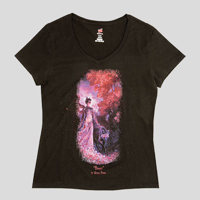
Winona Nelson is an accomplished artist and illustrator whose work has been published in several different mediums. One of her most recent personal pieces, an acrylic and oil painting titled "Bloom," was recently on display at the Arch Enemy Arts gallery in Philadelphia. Nelson has allowed Wearables to use "Bloom" as the basis of our last challenge. Competitors were tasked to replicate the painting as faithfully as possible. Screen printing was required to be used.
The shirts were judged on these criteria:
Technical Reproduction: How faithfully is the work of art reproduced on a T-shirt? Are the large and small details preserved? How closely does it match the colors from the original?
Inks and Printing: How is the clarity and the hand of the print? Were the screen-printing method and inks chosen suitable for the print? Were they used in an expert fashion?
Winner
T Productions
Circle 120 on Free Info Card
Our winner received high marks for its advanced techniques and excellent pre-press work, creating a detailed print which preserved the small elements that make this painting distinctive.
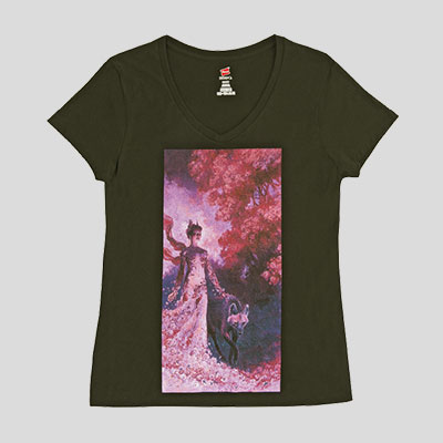
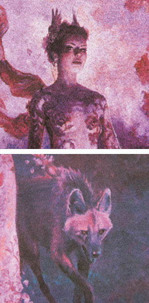
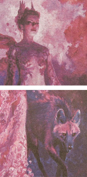
+ Highly detailed reproduction of the painting's key details, including the women's face and wolf's fur. Subtle details of the painting pristinely preserved, from the flowers of the women's dress to the definition in the tree leaves.
+ Demonstrated technical excellence, from the meticulous work with separations to the use of high mesh counts.
+ Softer hand compared to other competitors, a difficult task given the challenge to reproduce the painting in full.
+ Advanced use of screen-printing techniques, including a hybrid of index printing and simulated process.
+ Color is close to the original but mildly desaturated, earning the entry a minor demerit.
Runner-Up
Target Decorated Apparel
(asi/90549)
Circle 121 on Free Info Card
This entry featured a Hi-Res Accucolor process that created rich, deep colors and a highly detailed print.
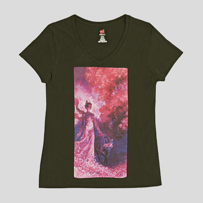
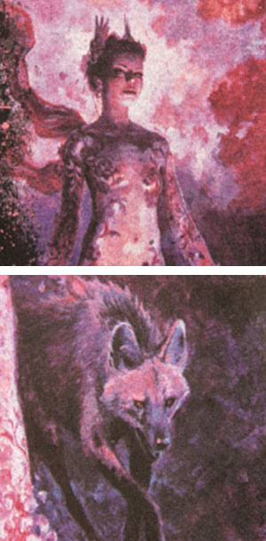
+ Subtle details of the painting well maintained, especially the flowers and shadows.
+ Excellent use of color, including vivid pinks and blues. While shaded a touch too dark, overall it was very close.
+Technical ability capably displayed, from good use of separations to the hi-resolution processes.
+Hand of the shirt heavier than other entries, most likely because black ink was printed instead of using the shirt color for the black in the image.
2nd RUNNER-UP
Aventa
(asi/31940)
Circle 122 on Free Info Card
This entry's strong showing was defined by creative presentation combined with lively color work and detailed printing.
+ Colors are vibrant and engaging and allow the image to jump off the shirt.
+ Cropping and title card gave the image a dynamic quality, instead of being presented in a static box. While one of the woman's hands was cropped out, overall the crop had a positive effect.
+ Strong detail in the print's larger elements, particularly the flower dress.
+Contrast of the image slightly off. The reds were accentuated too much, while the blues were a bit low, diminishing some of the image's depth.
Q&A
Wearables spoke with Tony Kozlowski, owner of T Productions, about the keys to reproducing a complex piece of art on a shirt and how to combined simulated process with index printing.
Q: To reproduce a detailed work of art like “Bloom,” what is the approach your company takes?
Tony Kozlowski: When it comes to reproducing detailed artwork on textiles, several things are taken into consideration. The level of fine detail determines final line screen, and the coloration of the design determines separation technique. If an image has a lot of small detail such as the woman's face in the “Bloom,” design, we like to go with 65 LPI for a simulated separation, and 150 PPI for an index separation, or both if a combination is used. DTS and high mesh counts are highly recommended for final output.
Q: You used a hybrid of index printing and simulated process. What prompted that decision?
TK: We felt that with a limited and very specific range of colors used in the original image, it would be best to match and print those colors, rather than simulate them with color blending. So for the color plates we used stochastic dots, or index color printing. We have always loved the way this type of dot prints on fabric, and is very forgiving with any unwanted interaction of garment weave, or screen mesh, since the dots are random. The underbase, black and highlight screens (the whole of the greyscale image) were pulled from a simulated separation and screens were produced using 65 LPI traditional halftones. We have always felt that creating the greyscale portion of the image (possibly the most important part of reproducing any image) using halftones retains better tonal balance and detail than index, but then overlaying the indexed color plates on top results in a great image in terms of detail, coloration and appearance.
Q: How were you able to preserve the detail of the work yet keep a reasonably soft hand to the shirt?
TK: In our case, to achieve a soft hand we used high mesh counts (230 for the underbase and 305 for the top colors and highlight) and good choices in squeegee durometer (65 durometer for underbase and 75 durometer for colors and highlight). Inks must remain as opaque as possible to achieve a bright print while laying down such little ink.

Product Hub
Find the latest in quality products, must-know trends and fresh ideas for upcoming end-buyer campaigns.