Product Hub October 30, 2014
2014 Big Decorating Challenge
The winning decorating teams used their creativity and business smarts to create a unified, functional apparel solution for a fictional, but demanding client.
If you want to stand out in the decorated-apparel business, you need to do more than just sell logoed shirts. You also have to brand and sell yourself as a consultant, becoming the go-to person whenever a client has questions about embellished apparel. “You can get T-shirts anywhere; you can’t get solutions and quality everywhere,” says Erich Campbell, digitizer/e-commerce manager at Albuquerque, NM-based Black Duck Inc. (asi/140730). “If you become a consultant, you’re much more valuable. If you make things easy and you help clients with solutions to their branding and marketing dilemmas, that’s part of the value you’re selling.”
That was the idea behind Stitches’ new competition, the Big Decorating Challenge. We wanted embroidery shops to flex their creative and marketing muscles by meeting a fictional company’s real-world requirements. So, we created Graham’s Greenery, a nursery and landscaping company with a long history and established clientele. The business is poised to expand into multiple locations and wanted a new, cohesive look for employees, whether they work behind the counter, in the greenhouse or in a client’s front yard. Decorating teams had to design a professional, adaptable logo that unifies the brand, exuding the look of craftsmanship and quality, without losing the down-to-earth heritage of Graham’s Greenery. The team also had to choose three pieces of workwear – a polo, a cap and an apron – for either a male or female employee on which to execute their original designs.
As might be expected, entries arrived in a sea of green, with an abundance of leaves stitched in various spots. The looks that really stood out chose bold colors and unexpected elements – like the stylized hummingbird fluttering atop our Grand Prize Winner’s logo. All five top teams displayed an eye for design and a technical acumen. They took a thoughtful approach to apparel, choosing garments not just for their aesthetics, but with their client’s needs in mind – picking items for their moisture-wicking and sun protection properties to benefit employees working outside. The finalists each created unified solutions that Graham’s Greenery could easily adapt to outfit all its employees.
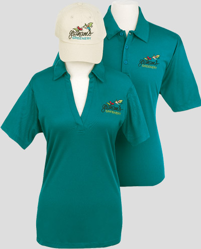
The Shop:
TEAMWORLD CORPORATE PROGRAMS
(ASI/342534), BINGHAMTON, NY
Colorful and full of life, this iconic hummingbird logo is a bold branding statement, expertly embroidered. The perfect marriage of creative design and production-friendly digitizing, it was the clear top choice.
The Solution:
TOOLS OF THE TRADE: The artwork was digitized using software from Pulse Microsystems, stitched out with Robison-Anton 40-weight rayon and polyester thread on a Tajima machine.
POLO: The Men’s Performance Polo (K540) and Ladies Silk Touch Performance Polo (L540) from SanMar (asi/84863) both feature an 8,900-stitch logo with six colors.
CAP: The Garment-Washed Cap (PWU) from SanMar also has artwork with 8,900 stitches and six colors.
APRON: The Port Authority Full-Length Apron (A500) from SanMar sports artwork with 8,900 stitches and six colors.
Original Artwork:
TeamWorld Corporate Programs combined hand-drawn lettering with a more professional sans serif font for the Graham’s Greenery logo to show off the brand’s quality, uniqueness and craftsmanship, according to Heather Burlison, graphic designer. After choosing the fonts, the team initially focused on leaves for the design’s centerpiece, but after feedback from colleagues, took a different tack. “That’s when someone suggested we create a hummingbird in thread,” Burlison says. “It’s more than trees and flowers, and it can also stand on its own as an icon for the brand.” The design caught the eyes of the judges, particularly Liz Hathaway, creative manager at Penn Emblem Co. (asi/77120). “The hummingbird is great for brand recognition,” she says.
Embroidery:
TeamWorld’s embroidery specialist Adele Brock described the stitch-out of their entry as “smooth sailing,” saying there were no production challenges. Hathaway and the other judges loved the design’s thread colors, but recommended tweaking the color of “Graham’s” on the dark polo shirt to improve readability. Judge Geri Finio, owner of Studio 187, admired the link between the bird’s wing and a leaf, which, she says, “combines the professionalism of the nursery with a whimsical logo.” She also praised the “excellent use of stabilizer.”
Decorated Apparel Presentation:
TeamWorld based its apparel decisions on color, choosing a deep teal tech polo from SanMar. The full-length apron and soft garment-washed cap were also SanMar picks. The moisture-wicking polo shirt is “lightweight, it keeps employees fresh and it can easily take the wearer from a day job to dinner and drinks after work,” Brock says. The judges liked that TeamWorld also considered the needs of Graham’s outdoor employees and chose a shirt with performance features. Another touch that upped the perceived value for the judges was TeamWorld’s decision to package the garments in a custom box.
Digitizing:
TeamWorld’s design displayed both technical proficiency and creativity, according to the judges. “This is a very solid, artistically rendered design that’s well thought out and purposefully digitized,” says Erich Campbell, digitizer/e-commerce manager at Black Duck Inc. “The garments lie well, the hat has great coverage and the addition of the iconic hummingbird as a back arch embellishment was fantastic. This is what good corporate embroidery looks like.” The digitizer took a production-minded approach, with good trims, jumps and locks, and color sequencing that wasn’t excessive. The one area for improvement is stiffness in the embroidery, with too much density where the shading lies over the ground fill in the flower atop the letter “H” and the hummingbird’s center, he notes. The satin stitches could also have less density.
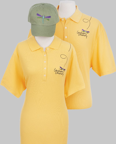
The Shop:
VISUAL IMPRESSIONS
MILWAUKEE, WI
Visual Impressions dazzled the judges with the artistically deployed metallic thread and skillfully rendered 3-D puff of the dragonfly logo. Questionable unisex appeal and minor finishing issues kept this whimsical entry from taking the top spot.
The Solution:
TOOLS OF THE TRADE: The artwork was digitized using Wilcom software and sewn out on a Barudan machine using Robison-Anton thread.
POLO: The EZCotton Piqué Polo Shirt (men’s K800, ladies’ L800) from SanMar (asi/84863) features a left-chest design with 5,522 stitches and eight colors. The shoulder design has 2,407 stitches and one color, and the back artwork consists of 5,570 stitches and nine colors.
CAP: The hat (AH70) from SanMar has artwork with 3,395 stitches and seven colors on the front and a design with 1,820 stitches and one color on the back.
APRON: The 65% polyester and 35% cotton apron (F10) from Chef Works sports artwork with 8,863 stitches and nine colors.
Original Artwork:
Visual Impressions created a sparkling dragonfly logo, with vibrant purple and green wings. Embroidered swirls over the shoulder mimic the insect’s flight path. The artwork was meant to evoke a natural feeling without being conventional. “Using the dragonfly allowed us to show off our embroidery skills, but also add some fun,” says Marshall Atkinson, chief operating officer of Visual Impressions. “We felt if we did something different, like sewing up over the shoulder, our concept would stand out from the crowd.” The judges appreciated the creativity, calling the dragonfly a welcome pop of color. “The shoulder swirl is brilliant,” Finio says. adding that the artwork was fun. However, the judges noted the design was feminine and questioned its unisex appeal, noting that decorators and artists should consider this when designing a logo.
Embroidery:
Visual Impressions broke out the special effects to make the entry stand out, employing metallic thread, puff foam and other techniques. Judge Finio says she loved the 3-D effect on the dragonfly. The judges also lauded the density of the embroidery, giving it marks for excellence. Two areas of concern: The company name could have been enlarged and made more prominent on the cap, and the stabilizer used on the shirt might be uncomfortable against the wearer’s skin.
Decorated Apparel Presentation:
The Visual Impressions team wanted a “bright, vibrant and fresh feel” and used a palette of yellow and green as a starting point, Atkinson says. “From there, we researched what styles and brands were available. We brought in stock and matched things up in-house, eliminating the choices once we had them in our hands.” Atkinson stresses that good apparel solutions are half design and half garment choice: “To some degree, most designers forget how the piece will sew on the garment, and what thread colors will look like on each piece. There has to be discussion about the look as a unit, but also how it will be produced for the individual item. There’s give and take.”
Digitizing:
Judge Bonnie Landsberger, owner of Moonlight Design, had high praise for Visual Impressions’ efforts, calling the three garments a “joy to test-sew.” She was impressed by the small lettering on the back of the cap. “It’s not easy to achieve clarity in small letters and takes careful digitizing and editing to get it right.” The blending on the dragonfly’s wings and the 3-D puff on the body were also skillfully rendered, she says. The digitizing followed all the rules, with a smooth stitch-out. “These three entries could not be more perfect,” Landsberger says.
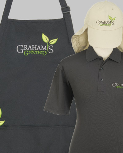
The Shop:
J&K EMBROIDERY PLUS
COLUMBIA, PA
The look J&K Embroidery Plus created was clean, cohesive and understated. The logo, however, was slightly flat and lacking in vitality – adding stitch variety would have elevated the entry.
The Solution:
TOOLS OF THE TRADE: The artwork was digitized using Wilcom and Pulse Microsystems software and stitched out on a Tajima TEHX-C1501 machine, using Madeira USA and Robison-Anton 40-weight rayon thread.
POLO: The Silk Touch Polo (men’s K500, ladies’ L500) from SanMar (asi/84863) has a left-chest logo of 8,754 stitches and three colors. The Web address on the sleeve has 2,480 stitches and one color, and the tree on the back of the neck has 929 stitches.
CAP: The Brushed Twill Low-Profile Cap (CP77) from SanMar has a front logo with 5,483 stitches and three colors. The Web address on the back has 2,952 stitches and one color.
APRON: The Port Authority Medium-Length Apron (A510) from SanMar features artwork with 6,828 stitches in three colors.
Original Artwork:
Jacqueline Cooper, owner and embroiderer at J&K Embroidery Plus, placed the word “Graham’s” above a stitched line and “Greenery” below, freeing up space on the ends for themed graphics. “I made a few sketches of leaves and trees, and put them in the spaces created,” she explains. “The line represents the landscape, the tree the nursery and the leaf the garden aspect of the business.” The judges appreciated the consistency and professional logo design, and the extra touches, like Cooper separating out parts of the logo and adding them to unexpected spots – like the tiny tree growing on the shirt yoke.
Embroidery:
Cooper kept her logo design crisp, simple and ideal for embroidery. However, the judges had concerns about the small lettering, like the Web address on the sleeve and cap. “I’m not a fan of small Web addresses on sleeves,” says Ginny Fineberg, owner of Sandpiper Embroidery. “Customers rarely copy it down from there.” The embroidery also had some issues with finishing: “The back should always be cleaned of threads,” Finio says.
Decorated Apparel Presentation:
The butter yellow and olive green color scheme looks fresh, evoking the idea of a nursery without devolving into cliché. The uniformity of design across all three garments made this a stand-out entry for judge Lee Romano Sequeira, co-owner of Sparkle Plenty Designs (asi/88442): “It’s a clean, consistent logo design.”
Digitizing:
Cooper partnered with Quality Punch, whose staff digitized the artwork that Cooper stitched onto the polo’s left chest and the cap’s crown, and then enlarged for the apron. Judge Jay Fishman, owner of Wicked Stitch of the East, lauded the digitizing: “Everything registers, the pathing is correct with sufficient trims and color sequencing.” But, he adds, to combat design flatness, “The leaves could have been done in a split satin or loose fill for additional texturing,” he says.
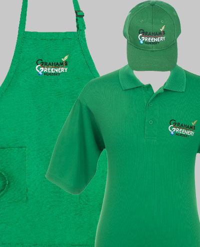
The Shop:
AzCa EMBROIDERY & SCREEN PRINTING
(ASI/701972), TEMPE, AZ
AzCa Embroidery (asi/701972) wowed the judges with smart apparel choices and clever design touches. Some digitizing problems left the embroidery susceptible to snags, and the decorator open to customer complaints.
The Solution:
TOOLS OF THE TRADE: The artwork was digitized with Wilcom Embroidery Studio and stitched out with Robison-Anton 40-weight thread on a Tajima machine.
POLO: The Tech Piqué Polo Shirt (K527) from SanMar (asi/84863) features a logo with 5,573 stitches and three colors.
CAP: This six-panel, low-profile cap with elongated bill and neck cape (EOM101) from alphabroder (asi/34063) features 5,573 stitches and three colors. The neck cape also boasts a colorful direct-to-garment garden motif.
APRON: The Port Authority Medium Length Apron (A510) from SanMar features artwork with 8,253 stitches and three colors.
Original Artwork:
The AzCa Embroidery team’s ideas revolved around plant life, transforming the “Y” in “Greenery” into a swooping stem that ends in two leaves. One of the leaves replaces the apostrophe in “Graham’s.” The leaf motif was repeated on the pocket of the apron. “It was important to me that the type of business was obvious at first glance,” says Jennifer Lamoreaux, graphic artist at AzCa Embroidery. “Also, simplicity is key. Too many times we see complicated logos that just don’t work on apparel.” The judges thought turning the apostrophe into one of the leaves was a nice touch, and the leaves sprouting from the apron pocket were endearing, furthering an overall cheerful design aesthetic. “The logo is very clean and the graphics are good,” says Judge Ginny Fineberg, owner of Sandpiper Embroidery.
Embroidery:
The judges liked the multimedia treatment on the cap: traditional embroidery on the body of the hat and a flower garden motif digitally printed on the neck cape. Several judges had concerns about the width of the stitches in the leaves’s satin columns. The fact that the leaves on the apron pocket didn’t line up with those above the pocket worried Fineberg. “That portion should have been redone or just have been done as a pocket topper,” she says.
Decorated Apparel Presentation:
The AzCa team put thought into how its apparel choices would benefit a person who works indoors and out. “All the items are soil/stain resistant so employees, while working in the dirt most of the day, still looked professional,” says Jeanette Noiles of AzCa. The uniform also provides protection from the sun; the hat and shirt have a UPF of at least 40, and the polo boasts moisture-wicking technology. The judges liked the cap’s elongated bill and sun-shading neck cape.
Digitizing:
Judge Kathryn Ostrander, digitizer at Sandpiper Embroidery, loved the look of the pocket and hat design, praising the block sequencing, but she had concerns about the sequencing of the lettering. She recommends changing “Graham’s” to run “center out,” as “Greenery” was programmed to do. “This prevents the hat and fine knits from puckering,” she says. She echoed the first-round judges’ worries about the width of the satin stitches on the leaves. The pocket leaves, with stitches 17mm wide, wouldn’t sew out on Sandpiper’s machines, even with jump stitches. The wide stitches are especially vulnerable to snags. “The customer likely would return the garments,” Ostrander says. “This is a digitizing flaw.” She suggests a long, split-stitch satin column, which would look the same but be sturdier.
The Shop:
A.D.E. & CONSULTING LLC
CENTENNIAL, CO
A.D.E. displayed creative thinking and strong technical skills, but the logo was busy, using too many techniques and ideas. The identical deep green of the apparel could also be too uniform.
The Solution:
TOOLS OF THE TRADE: The artwork was digitized on Wilcom E3 software and stitched out using Madeira 40-weight polyester thread on a Melco XTS machine.
POLO: The polo (5095) from alphabroder (asi/34063) features a left-chest logo with 10,744 stitches in seven colors.
CAP: The hat (6204), also from alphabroder, has a design with 9,958 stitches in seven colors on the crown and a Web address on the back with 2,573 stitches in one color.
APRON: The alphabroder apron (4350) has artwork with 13,466 stitches in seven colors.
Original Artwork:
Jorge Yadid, owner of A.D.E. & Consulting, says the basis of the design was the font, chosen for its naturalistic look, particularly the end of the “G” in both “Graham’s” and “Greenery,” which resembles a leaf. “I started manipulating the ‘G’ and ended up interlocking them, which evoked plants’ growth process,” Yadid says. “One ‘G’ represents the water and the other the growth. The water leads to growth, and it’s a continuous process. It shows Graham’s Greenery makes it happen.” Judges liked the creativity of the leaf in the letter “G,” the arc of the water and the logo’s textured branch, but said the overall effect was busy.
Embroidery:
Yadid says he adjusted the logo’s size, as well as customizing the design, pull compensation and density for each garment. Judge Finio appreciated the stabilizing cover and the embroidery techniques used in the design. “The blending in the drop and the texture on the branch are both well done,” she says. However, Finio points out, the two “E’s” in “Greenery” on the shirt were too close together.
Decorated Apparel Presentation:
The judges liked the environmentally conscious look of the logo, which evokes the idea of conservation and the growth cycle. Not so subtle was the bright, uniform green of the apparel, which the judges found a little loud. “I wish the garments were different shades,” Judge Romano says.
Digitizing:
A.D.E. & Consulting used satin letters, a regular fill stitch for the leaves and a program fill stitch for the center branch to give it realistic texture. The decorator used a blending stitch for the water drop. Judge Fishman was impressed with the digitizing, calling the program split for the branch creative. Color changes, registration, pathing and trims were well done. The drop’s level of detail and shading would work better for a larger image. “Less detail would draw the eye to the logo’s overall creativity,” he adds.
Product Hub
Find the latest in quality products, must-know trends and fresh ideas for upcoming end-buyer campaigns.