Strategy August 04, 2015
Tailor-Made Solutions
Set yourself apart. Innovate and create customized products and packaging.
Set yourself apart. Innovate and create customized products and packaging.
While promotional products technically are customized solutions, some projects or clients present challenges that up the ante and demand an even more specialized approach to delivering the brand message. This is an opportunity for suppliers and distributors to pull out all stops, creatively, when it comes to both product development and packaging.
Ninety percent of Mallory Dempster’s business revolves around “creating something that hasn’t been made before,” says the Jack Nadel International (asi/279600) promotional marketing consultant. “I focus on concept to completion. My clients rely on me to give them the full-service approach and deliver exceptional ideas. I am an extension of the marketing and branding team. They let me be as creative as I can be, and I take their brand and translate it into a product.”
Thinking outside the box, when it comes to designing the box, can elevate a product and differentiate a brand among its competitors. “We see custom packaging as an area of growth for us,” says John Resnick, president of Proforma Printing & Promotion (asi/300094).
The creative side of the promotional product sales and consulting process can’t be underestimated. Here, supplier and distributor experts share stories of wowing their clients with their innovative approach.
Upscale Solution
Dempster primarily works with nightlife and music festival clients, who define and demand “cool and different,” she says. One client, Hakkasan Group, is an international entertainment, dining, nightlife and hospitality company. Dempster has done a number of projects for Hakkasan, and most recently helped them with the grand opening invitations to a new nightclub in Las Vegas called the Omnia.
These are not your typical paper invitations, and according to Dempster, also “not for the faint of heart.” They are typically extravagant, can take 3-5 months to develop, and often the venue they’re promoting has not even been built. Her invitations to the Omnia opening were sent to A- list celebrities, publicists, and the “who’s who” of all major cities.
She usually starts with deks and pictures, maybe some color, and a description from the client about what the venue and brand is about. “I have a great artist, and I mentally create concepts which he puts onto paper,” says Dempster about her creative process. She then supplies art files and pitches her ideas to the client.
“We refine 10 ideas down to one, and then we go to samples,” she explains. “We do it until it’s right. The first sample never is, so we tweak it and re-sample. These clients are very detailed.”
Despite deep pockets, Dempster says this type of client always has a budget. There is wiggle room, however. “If I come up with something new and cool that is outside of the budget, they will find a way to make it work,” she says.
In the case of Omnia Las Vegas, Dempster was provided with a few details about the focal points: its impressive DJ lineup, 75,000 square feet of open space, and how it would be unlike any other Hakkasan property. She was tasked with conveying a theme of technology and modern luxury.
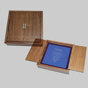
“For me, it was all about the packaging, and making the customer an immediate part of the experience,” says Dempster. She focused on the wood found throughout the opera house-like venue and designed a custom wooden box made of dark stained American walnut. The box had custom hinged doors, which were a replica of the front doors of the Omnia.
When the box is opened, it evokes a mood of purples and blues, and a theme of “moving color and energy.” A glass invitation supplies the details of the event. When the invitation is removed from the box, the warmth of the recipient’s hands activates the colors of the glass, which were custom set to a range of temperatures and nine different colors.
“We customized colors and set them to specific temperatures based on geographic locations of recipients,” she says. “In addition, a 7-inch high-definition pop-up video screen plays a video in which celebrity DJ Calvin Harris talks about the unique qualities of the Omnia, and then personally addresses the recipient by name.”
Dempster says she micro-manages this type of project and puts every detail under the microscope. “You can’t send Jay-Z Kanye’s box,” she says. To avoid mistakes, she created numerous labels of all the names of the 620 recipients, and put them on the backs of the video screens, USB drives and shipping labels, and spot-checked every 10 names. Her efforts paid off, as this particular promotion had a zero mistake rate.
“The president of the Hakkasan Group told me it was the coolest thing we’ve ever done,” says Dempster. Two of her projects have won ADDY (American Advertising Awards), including a previous project she did for another Hakkasan nightclub.
“If you’re stuck and your sales are stagnant, think outside the box and think big picture,” she says. “Nearly every corporation sends an invitation to something. Start thinking outside the lines of just promotional products and catalogs and focus on what will increase your value to your client.”
Custom Rebranding
SOBO Concepts (asi/329592) couldn’t resist a sweet opportunity when it was tasked with completely updating and rebranding Hoffman’s Chocolates, a regional chain of seven shops in South Florida in business for decades. The Venture Capital (VC) firm that bought Hoffman’s wanted to inject new capital and build it as a strong regional chain.
“Hoffman’s was our first project on this large a scale; every aspect was designed by us,” says Dean Schwartz, the company’s self-described SWAG Master. “Since many people only think of chocolates for holidays, our goal was to come up with a way to get people in the store every day.”
SOBO presented three concepts to the VC, and ultimately agreed on a theme of “Celebrate the Everyday,” driving the message that there is always a reason to celebrate with chocolate. For the logo, SOBO placed the brand name inside a stylized hexagon, reminiscent of a honeycomb. They chose a central color scheme of dark chocolate brown. This was an obvious reference to the product, but it would also pair well with other brighter packaging colors, which were ultimately color-coded to distinguish among the different varieties of chocolate.
Initially, SOBO supplied new product sleeves for existing Hoffman’s chocolate boxes, along with new labels and stickers. Stripes became an important part of the new look, and were featured on store awnings, accent walls within the store and paper shopping bags.
SOBO ultimately redesigned Hoffman’s shop, advertising the “Celebration” theme using marquis signs and lights. The rebranding, which began last October, was promoted during the holiday season by the opening of pop-up shops and kiosks. Hoffman’s new look was recreated at a pop-up shop at the Sawgrass Mills shopping mall, creating a 3-D wrap to duplicate its brick walls and awnings.
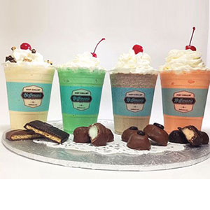
The distributor also supplied uniforms: white cotton/polyester, soil-resistant button downs with embroidered sleeve logos, custom-printed aprons and custom-shaped name tags. Every aspect of the store, including coffee cups and shake cups, featured consistent branding.
“Our client didn’t want another Godiva,” says Schwartz. Understand the client’s demographic and messaging, and establish a look that differentiates it from its competitors.

A high-end package and invitation announced the opening of a posh nightclub.

A total rebranding called for a slew of ad specialties.

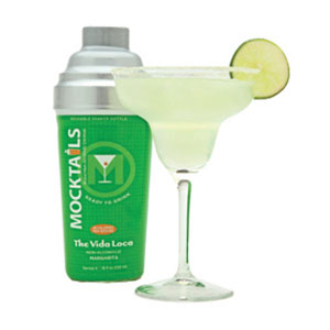
Martini-shaker packaging quenched a beverage maker’s thirst for unique.
College Customizes Pop! Sample Kit
Pantone branding is huge for the education market, as colors can be matched exactly to school colors. One of supplier Pop! Promos’ (asi/45657) distributor clients was working with a college that wanted a giveaway for its largest donors. It was to be distributed at a gala dinner. The school had ordered custom Pantone-matched sunglasses in the past, but was looking for a bigger budget item to thank its benefactors, says Julie Touchstone, Pop! director of marketing and branding.
The distributor had seen Pop!’s newly redesigned sample kit, featuring three Pantone-matched products in a clear box with a custom marketing insert, and wanted to offer the college something similar. “We don’t typically offer prepackaged sets to our clients,” says Touchstone. “Although we have the capabilities to design custom packaging, these types of projects fall outside of our standard product line.”
The college selected a variety of Pantone-matched items from Pop! Promos, including newly designed sunglasses, the “brandana” (multifunctional rally wear that can be used over 11 different ways) and a charger, all featuring the school’s logo, to be housed in a custom clear box. A custom insert was also included that contained information about contributing and how donations help the school. The box would be preassembled and sent directly to the end-user.
Pop! Promos collaborated with the distributor to design the products and insert card in the school’s Pantone colors. “We did several free virtual designs of products that would be included in the kit,” says Touchstone. “This allows the client to see what the product will look like before it goes into production.
“Collaborations on customized orders such as this can be more time-consuming, as they’re not standard, but they are a great opportunity for both the distributor and the supplier to be creative,” she says. “Also, these orders can be more lucrative, as there is more wiggle room in the budget. Plus, if it turns out well, it can lead to re-orders.”
Well-Planned Packaging
When Bill Gamelli, president of Mocktail Beverages, developed Mocktails Brand, a non-alcoholic party cocktail, his challenge was how to differentiate a whole new product and new category. The goal was to make the product stand out on the shelf, while also conveying the idea of fun. Nearly half of U.S. adults are non-drinkers, for a variety of reasons, according to Gamelli.
“My hope was to make a non-alcoholic drink as fun as one with alcohol, and create a nice, premium cocktail even if you don’t drink,” he says. The line of four cocktails he developed are all natural and contain no preservatives, no high fructose corn syrup, are low in calories, gluten and allergen-free, BPA free, made in the USA and are also kosher.
Gamelli came up with and filed for a patent to package the beverage in a cocktail-style shaker before meeting with packaging companies to get their advice and input. “I was a finance guy. I knew nothing about manufacturing. I couldn’t have guessed how complicated it was,” he says.
He hired TricorBraun Design & Innovation Group to build the shaker-style packaging for Mocktails Brand. “Their reputation, global resources and knowledge of where and which subcontractors to use helped us avoid a lot of mistakes,” he notes.
They collaborated and developed a 21-ounce custom reusable glass shaker with a built-in strainer. Each of the four flavors comes in a brightly colored shaker designed to reflect and identify that particular cocktail. “Everything is customizable right out of the bottle,” Gamelli says. Consumers can add ice, shake and strain and serve the drink straight from the bottle, or those wishing for a true cocktail can add alcohol.
“The shaker helped create our brand image, and we’ve gotten lots of attention,” says Gamelli. Mocktails Brand was awarded a Bronze award at the “Spirits” division at the 2014-2015 World Beverage Competition for their “Best in Show” packaging. The brand also received an American Package Design award from the 2015 Design USA Awards judges.
“When you come up with something fresh and disruptive and new, people are excited to bring the product into their stores, vs. a ‘me-too,’’ Gamelli says.
Quick Thinking
Proforma Printing & Promotion (asi/300094) faced a challenge when helping a client, BT Americas, offer a premium product for an IT security conference that would tie into the conference but also to BT’s marketing campaign which was titled, “The Art of Connecting.”
“The BT logo is full-color, so finding the right product is always a challenge,” says Proforma Printing president, John Resnick. Proforma came up with a TSA-approved travel luggage lock, but the imprint area was so small that the only way to decorate would be as a one-color logo, with no room for a URL or any other information, Resnick notes.
“We were concerned the product by itself didn’t tell a message – it was just a lock,” he says. Resnick recommended creating custom packaging and having the locks inserted into the boxes. The packaging would print using full-color processing on all four sides so they could deliver the desired message.
“We quickly went into scramble mode,” says Resnick. Proforma partnered with Independent Folders (asi/62554), and Resnick overnighted a sample of the lock. Independent quickly created a template for the box that would be the appropriate size, and Proforma’s client then created the art.
“Independent was great. We shipped them all of the locks, they printed the custom boxes, inserted the locks and drop-shipped to three locations,” says Resnick. “We were able to present a custom solution in a short period of time, and made the product come to life.”
Concept Projects
Activate! Promotions & Marketing (asi/141964) tapped into its creative side when it designed a promotional mailer for a client that wanted to set up more appointments with its prospective customer base.
“The client wanted to piggyback on the trending popularity of the craft beer industry. They wanted their prospects to ‘Tap Into’ their capabilities,” says Billy Booe, vice president of business development.
“This is where having your own creative group sets your distributorship apart from the competition,” he says. “This resource gives us the ability to illustrate solutions using promotional products, which most of our competitors can’t replicate. It helps us create more energy, excitement and engagement, and lastly, it takes our salespeople out of the commodity market and positions us as a solutions provider.”
Ultimately, the team designed a three-phase mailer for the client. The first phase consisted of custom coasters with messaging and highlighted valuable services they provide. The next week, they received a custom shoebox size package containing specific messaging, a stainless-steel pint beer glass and the image of a beer tap with liquid ideas filling up the glass. The call to action on this phase requested a face-to-face meeting. The third and final phase was completed when the client’s representative brought more glasses and a case of craft beer to the meeting.
From a client perspective, they can stand out and be memorable with specific messaging, packaging, content and delivery versus just handing out a pint glass,” says Booe. “Concept programs usually require a team effort, so make sure you identify and clarify everyone’s role within the creative and sales process.”
Many times, Activate! will have its creative team, salespeople and sometimes a supplier involved during those client meetings, so it is important that everyone knows their job and can articulate what they can do for the client.
He also recommends finding the best supplier in a product category, and including them on user calls and client meetings. “Distributors don’t use suppliers enough,” Booe says. “Suppliers are in the trenches every day. They’re meeting with you, as well as your competitors, so they hear and execute all kinds of ideas.”
Bringing along trusted suppliers boosts the distributor’s credibility, provides separation from competitors because the solutions are more unique, gets them out of the price arena and increases their profit margins. “The point is to show your client you are well connected, and have access to relationships and resources which your competition can’t, or even won’t, provide,” says Booe.
Concept programs such as the “Tap Into” mailer allow a distributor to really differentiate its team. “You can achieve higher profit margins because the client really can’t shop this approach out,” he says. “Once you do a few concept projects for a client, they will only want to work with you, and in doing so, you’re building an annuity-type of relationship.”
Apparently clients are catching on. “Our number of creative requests are up over 200% in 2015 versus 2013,” he adds.
Tip:Creative thinking separates you from your competition. “Anyone can source and quote a product; we want our clients to recognize there is value to using us,” Resnick says. “We are constantly focusing on ROI for ourselves and our clients. If we can provide an option that will accomplish their goals and they can save money, we’ll do it.”
Jean Erickson is a NJ-based contributor to Advantages.
