Strategy June 02, 2017
5 Rules for Better Fonts
Choosing sans serif fonts that aren’t too small can help make your text more readable.
The nature of embroidery can sometimes make lettering a challenge, especially as you decrease font size. Here are a few general guidelines to help you increase readability of the logos you sew. While there are always exceptions depending on the fabric you’re using, these five tips are a good rule of thumb to follow.
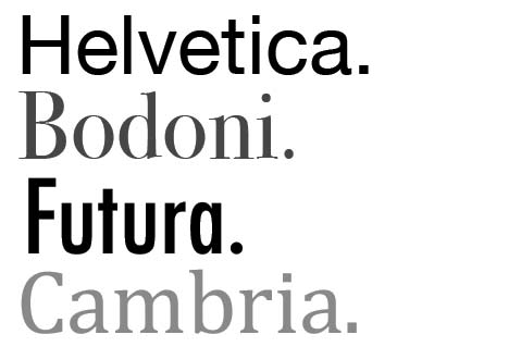
1. Stick with sans serif fonts.
Fonts without the tiny decorative flourishes known as serifs work better for embroidery. This is especially true the smaller your letters get, according to Jane Swanzy, owner of Houston, TX-based Swan Marketing. “It’s very difficult, even with good software and a great machine, to make a name done with a serif font look good at a quarter of an inch tall,” she says.
2. Avoid contrasting colors.
In general, text looks better when the thread colors don’t contrast too much, says Andy Shuman, general manager of Topton, PA-based Rockland Embroidery (asi/734150). “For example, gray text will look better on navy than white on navy,” he adds.
3. Don’t get too tiny.
For optimum embroidery quality, your text should be at least 0.25” tall, Shuman says. On smooth fabric, you can sometimes get away with smaller lettering, he adds, but 0.25” is a good goal to strive for.
4. When in doubt, test it out.
If you’re unsure of a particular font, do some sew-outs at different sizes, Swanzy says. That way, you can see if any of the letters have problems as they get smaller, such as the hole in a lower-case “e” closing up or the dot of an “I” butting up against the main part of the letter.
5. Strive for brevity.
Regardless of the font chosen, discourage your customers from including too much text in an embroidered garment. A left-chest logo or hat design isn’t the same as a business card and doesn’t need to be overloaded with web addresses or phone numbers. “A branded garment should be used for brand recognition, not necessarily a billboard,” Shuman says.
Watch This!
In this video, decorating expert Bill Garvin explains how to create shadow text using Gunold’s MicroFonts software.